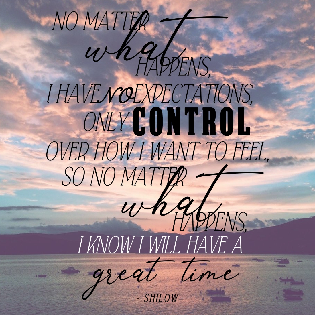
I chose this poem mainly because it is very sweet and really describes a certain way of living that most people should follow. For me, I know that if I live in the moment I will have a great time just like the poem says. The fonts I used are Falkin Serif Italic, Anthoni Signature, Snell Roundhand, and Impact. The main one I used was Falkin Serif Italic because I think it looked the best with the other accented fonts. Most of these I got off of Google Fonts or Da Font. I chose them because they flow very well with the meaning of the poem and the visual meaning of the poem. I arranged the words the way I did so they are eligible enough but are elegant as well. I accented the words that show expression or emotions, like “control” and “great time” so they stand out more than the regular words. The only real problem I had was how to format each word or create a layout for it. I decided to center the whole thing in the middle that way you can still see the picture in the background. I am most proud of the format and my choices in fonts. I feel like it all just comes together very well and it really suites the poem. I honestly do not know what I would do differently. I think, for me personally, I had enough time to create exactly what I wanted and envisioned.
